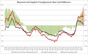
The problem with this Zero Hedge “implied unemployment rate” chart that the wingers are screaming about as proof of a massive “Democrat Party scam” is the fact that Tyler Durden ran the numbers back for 30 years and it exists all the way back to the Reagan era, and it shows that the “real” unemployment rate under President Bill Clinton was actually under two percent by the time he left office. Slick Willie was such a monster that he lowballed his numbers every month for both of his two terms and spotted himself a higher 4.0% plus unemployment rate instead, and then George W. Bush came along and quadrupled it from 2 percent to 8 percent. (Why Bush the Elder didn’t learn from his boss, I dunno.)
Not only that, but the implied rate under St. Ronaldus (nearly 14%) was far worse than anything currently under the Obama administration (falling from 12%), meaning that if we’re measuring who the worst President in history is by the implied unemployment rate and by how far the numbers are “lying” then that particular crown goes to Jellybean. His guys basically shaved 3.5 points off the unemployment rate for the entirety of his first term and still got him re-elected overwhelmingly in 1984 as a result. Of course, since that’s the benchmark, it doesn’t count. President Obama took a far worse collapse and is handling far better than Reagan did with his recession, so of course everyone has to ignore 95% of the chart.
You know, because President Obama is judged by a different standard for reasons that nobody on the right can seem to articulate…

No comments:
Post a Comment