From Flowing Data.--SS
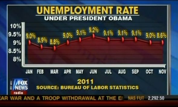
Charts and graphs are great, because they can let you see a pattern that you might not see in a spreadsheet, but they only work when you use the actual data. Fox News isn't doing themselves any favors by putting up this chart. It shows the recently announced drop in unemployment rate to 8.6 percent as a non-change.
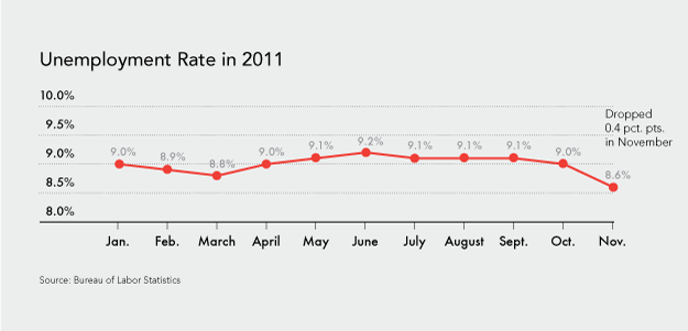
The November rate is lower than the March rate of 8.8 percent, but it's shown to be higher in the Fox News chart. Here's what the graph should look like, according to data from the Bureau of Labor Statistics:

It doesn't quite beat the best pie chart ever, but it's close.
Honest mistake? Wishful thinking? Little of both?
[Media Matters via @periscopic]

No comments:
Post a Comment